Groundmapper Usability Audit
Role
Product Designer
Employer
Idox PLC
Platform
Web
Design Framework
Tailwind
The Problem
Groundmapper was intended to be a top tier Cloud GIS platform that simplified the sharing, management, and analysis of location-based data.
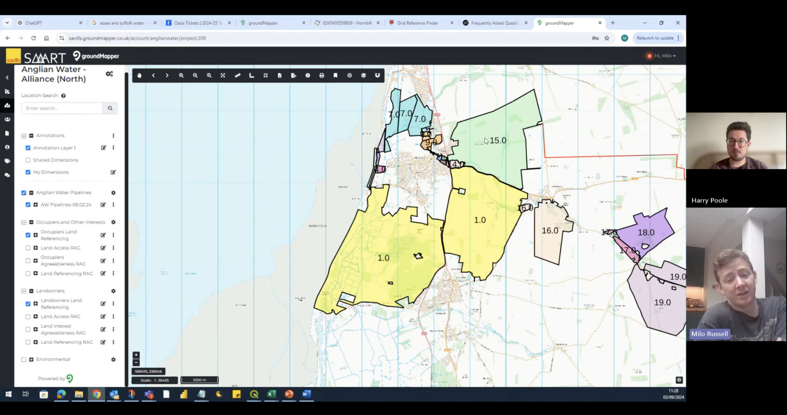
Over the years however a granular feedback damaged the usability of the platform. A minority of use cases were greatly catered for while the majority of users struggled to work within convoluted journeys.
Due to a lack of funding the platform had also become dependant on old technology. With other platforms advancing, the Ui needed a general update to bring it up-to-date.
My approach
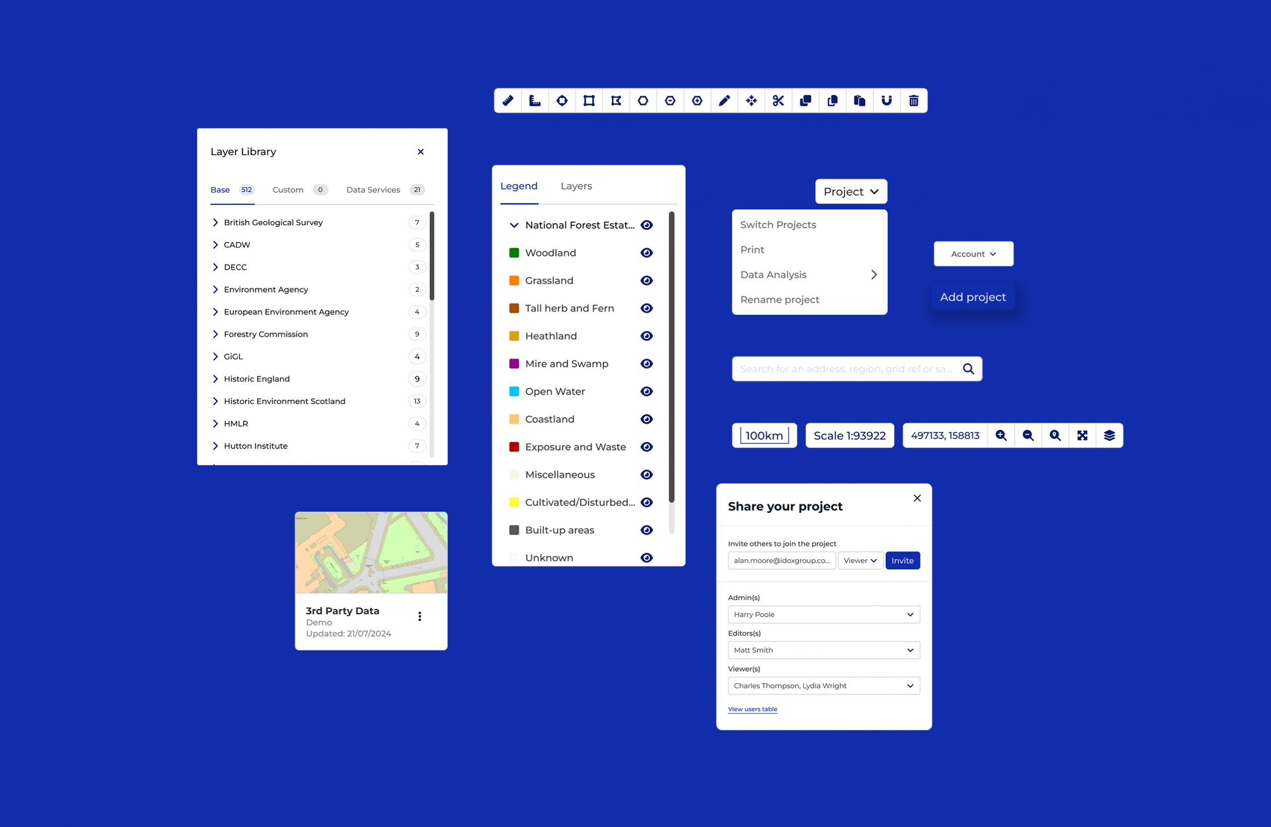
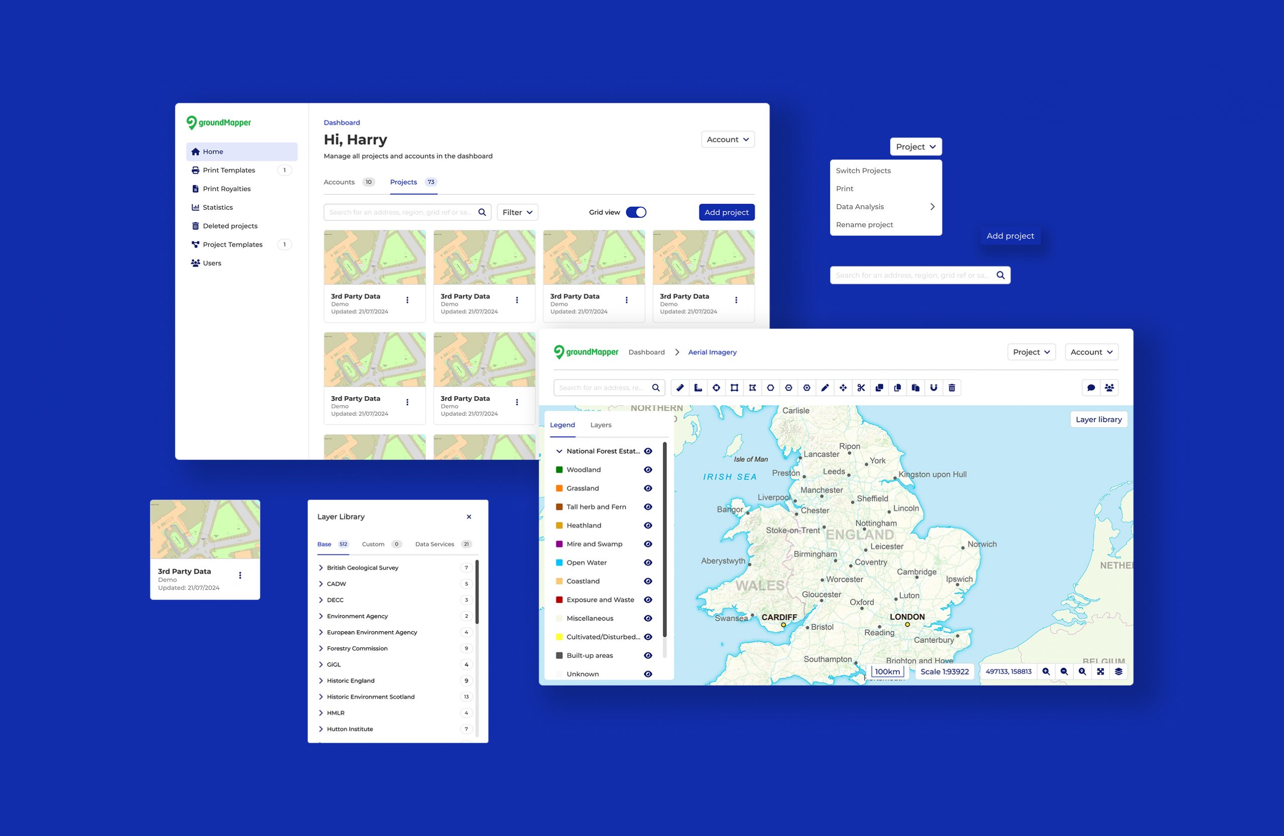
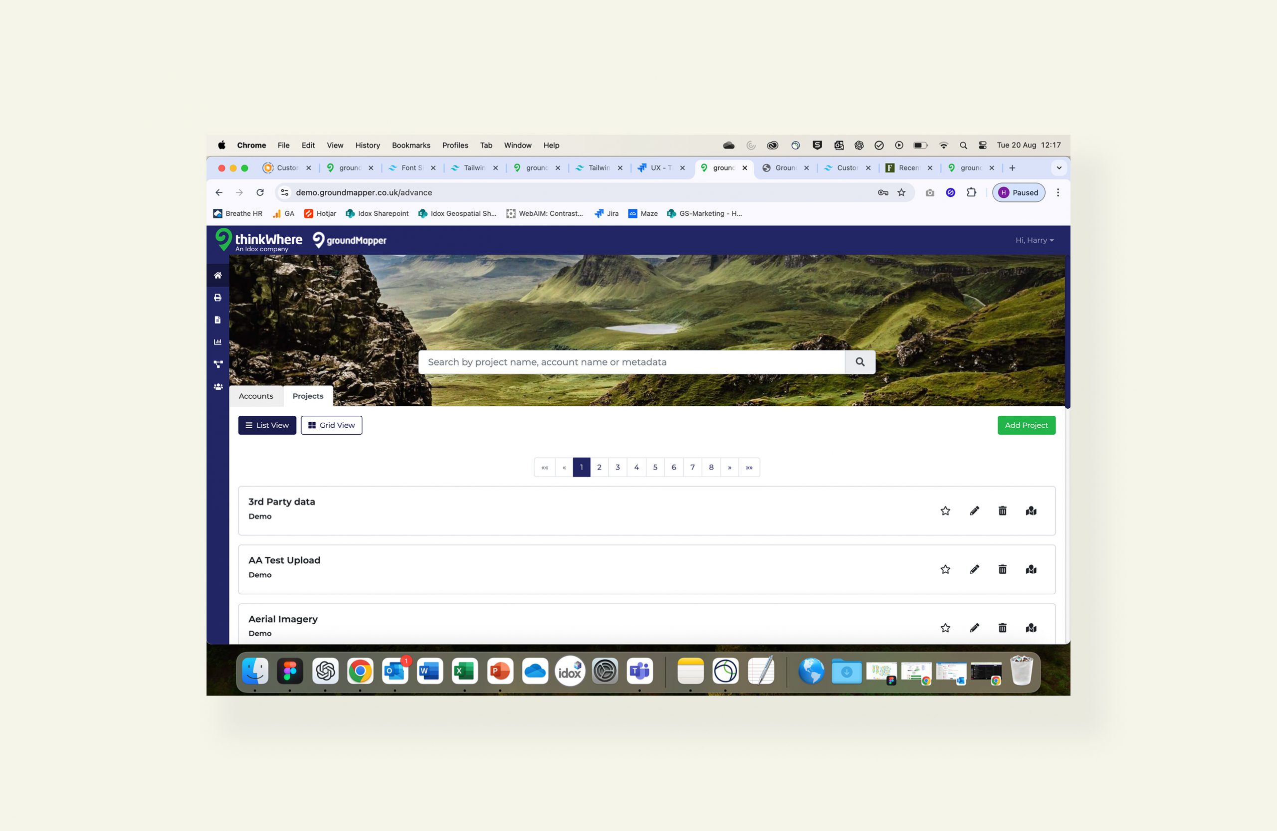
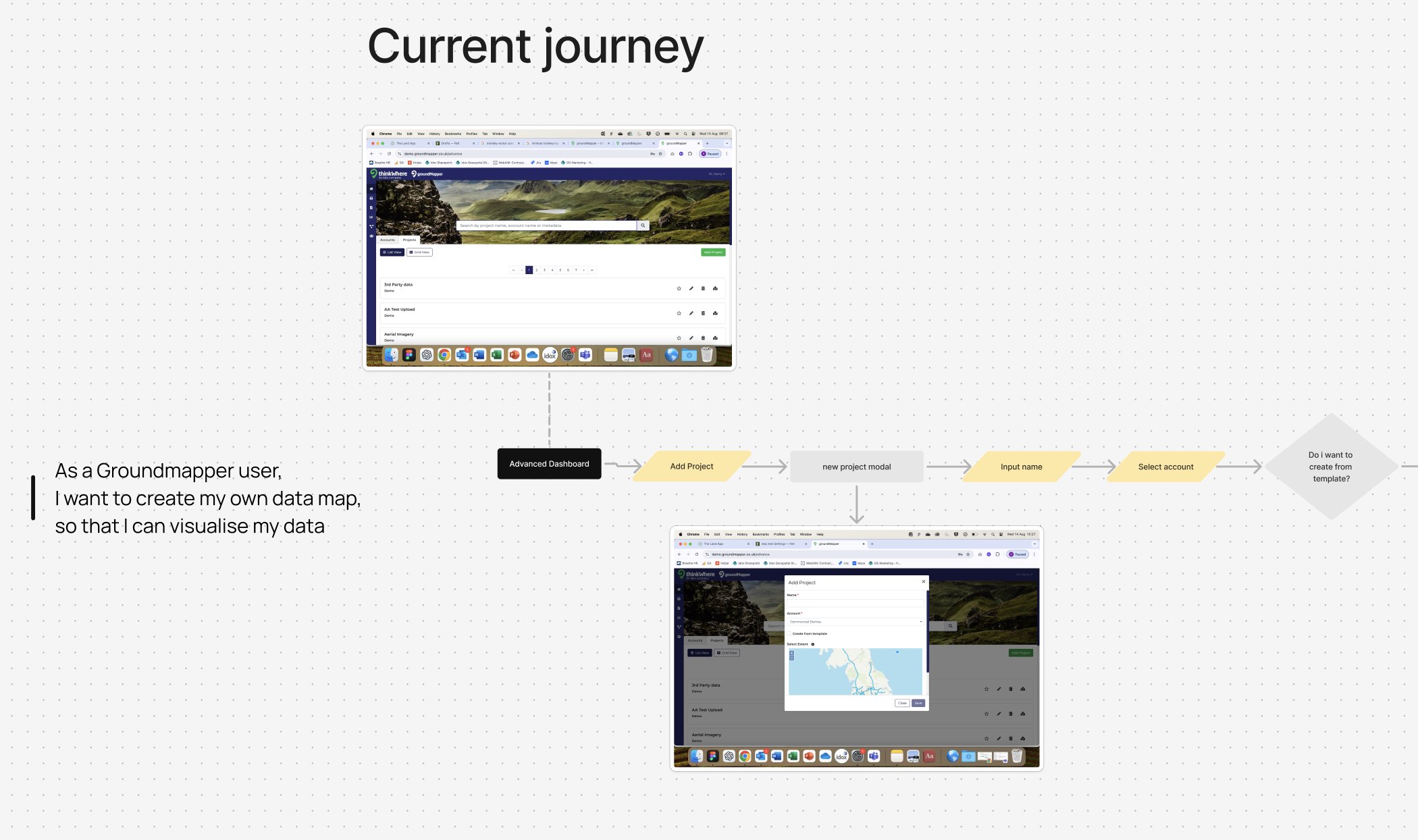
The web app needed a component level audit to understand how the details became devilish for the users. This meant;
- Conducting interviews with users was needed. This could create aggregated feedback and allow me to document key flows and patterns within the app.
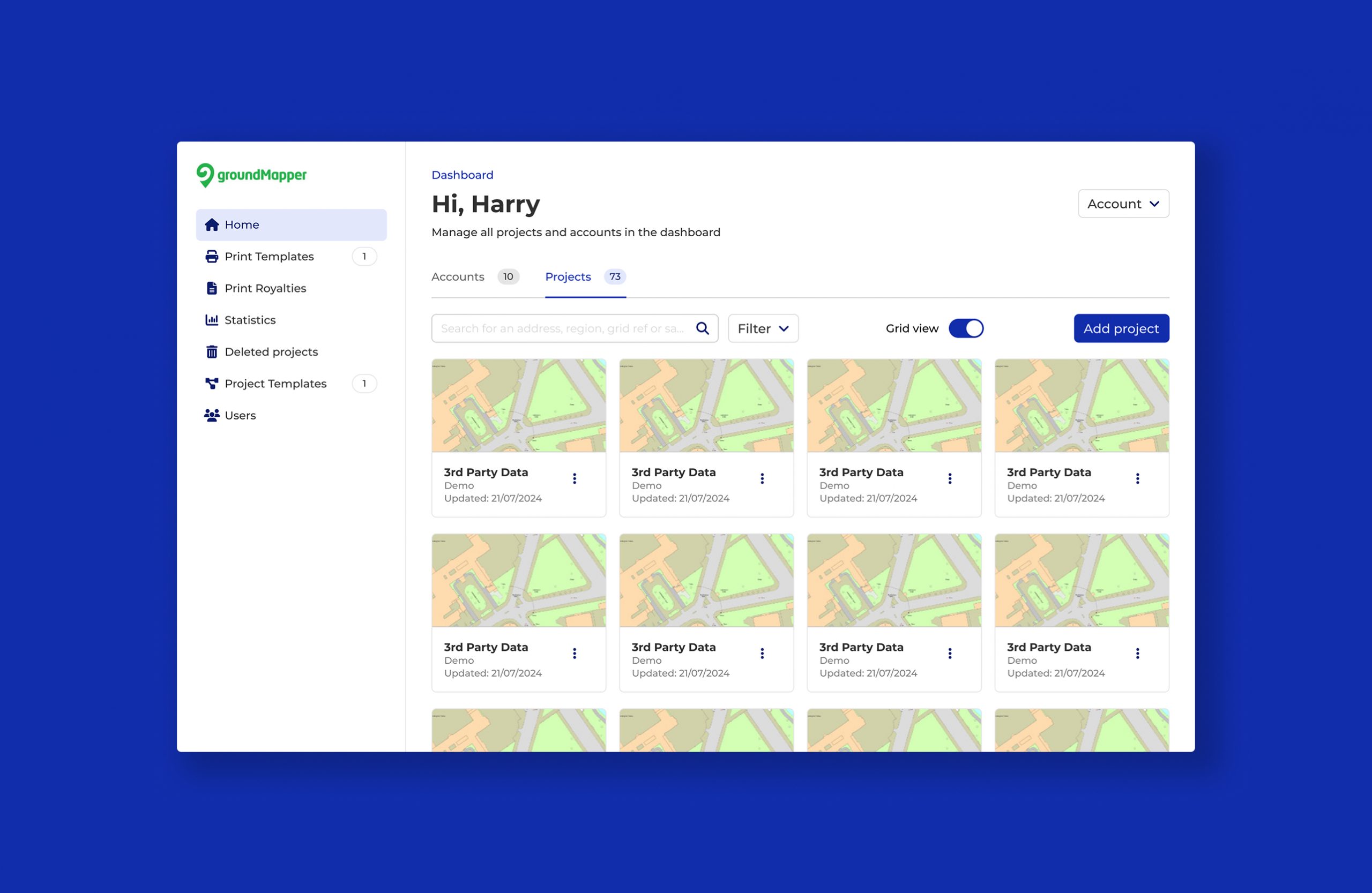
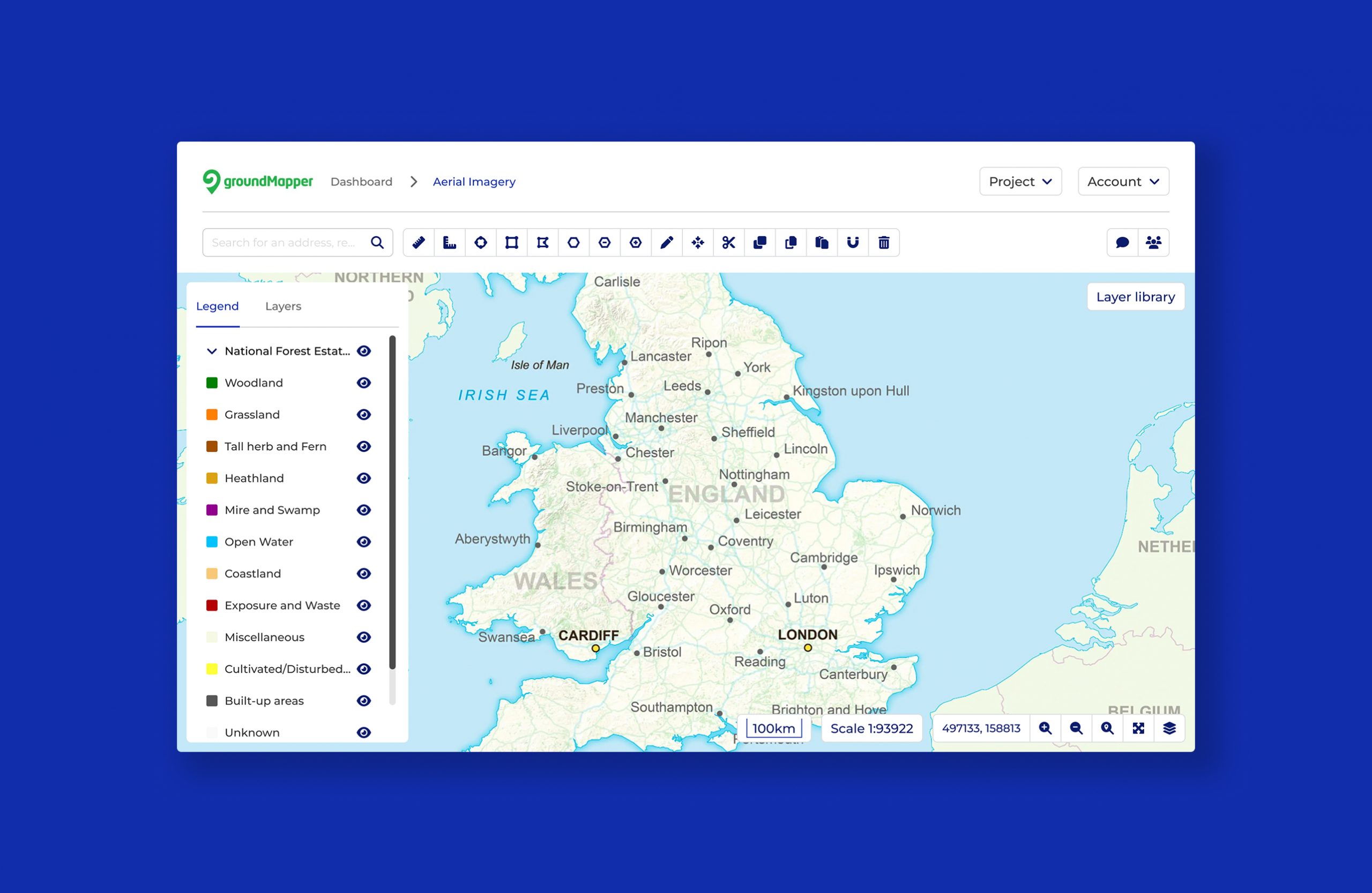
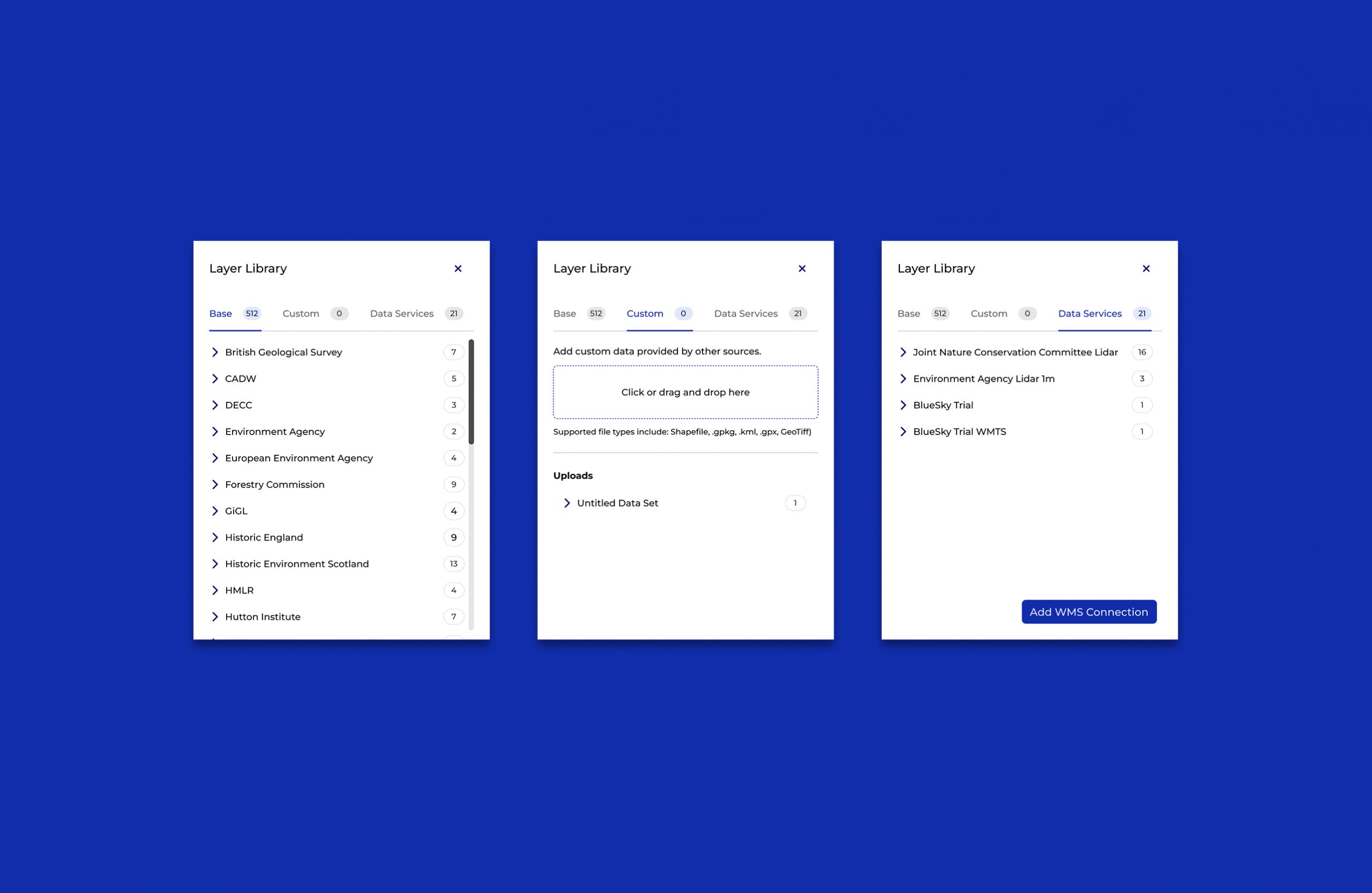
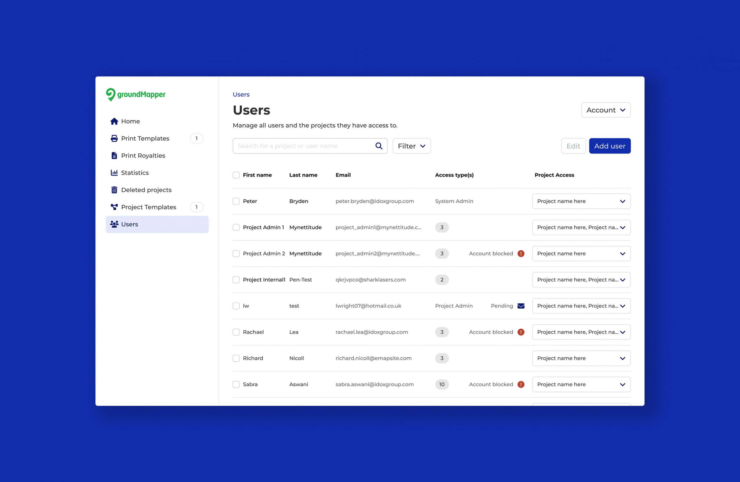
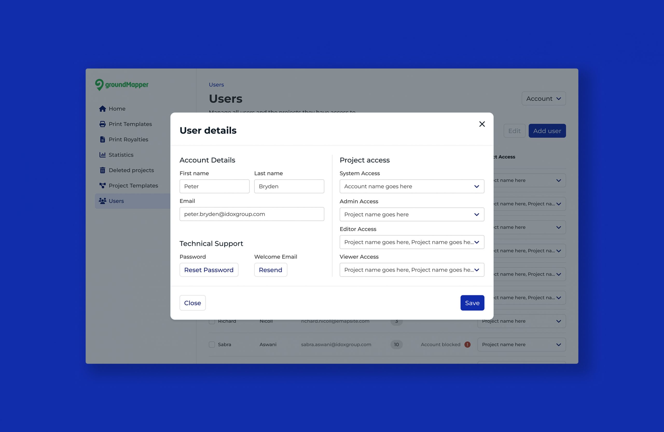
- Document key screens and components to understand which specific parts of the app users found confusing, or users could potentially struggle with due to accessibility.
- When designing new screens, I should then utilise Atomic design principles and Tailwind components.
Impact
When talking to users it was clear that they felt some parts of the platform were a struggle to use. A few users even commented on the fact that a feature they found useful, was taken away from them a few years ago!
So with this in mind, using Tailwind and standardized usage patterns, I created a design system that aimed to bring back components to expected places, which resulted in creating simpler journeys for users.