Rachel Thilwind Brand Experiment

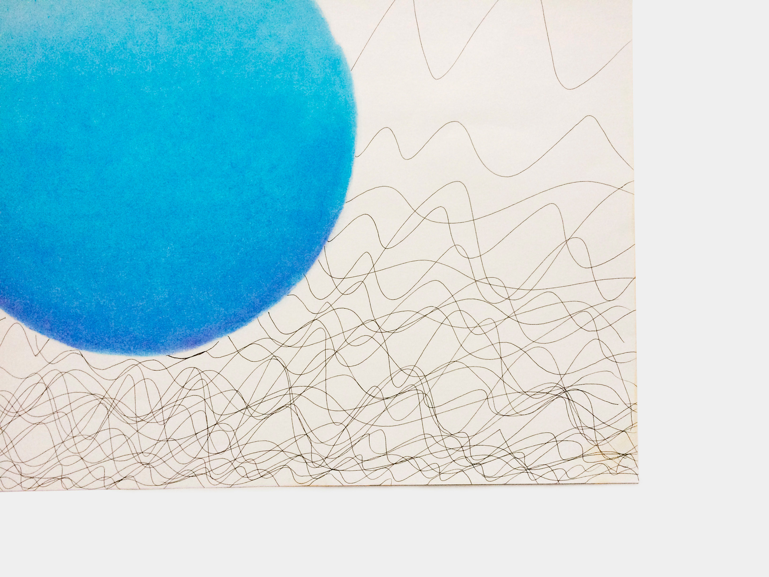
In creating an identity for Rachel Thilwind’s Pilates brand I carried out development and research work. As the project progressed I wanted to provide an option for Rachel’s identity where it would use a simple aesthetic, yet create something that had an expression of calm against chaos. It would essentially reflect how Pilates is a time of calm away from everyday life.
With calm expressed through a soft, blue, circular shape, and chaos imagined as frantic, crisp lines, an expression of what Rachel and I believed to be Pilates was formed. Combined with typography for the ‘concepts’ pitch, it became a favourable idea with Rachel, and as a stand alone piece, it provided to be a valuable experiment in creating Rachel’s final identity design.


Similar projects
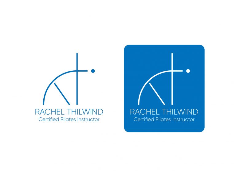
Rachel Thilwind Brand Experiment